Taylor Sustainability hub
UX, UI, Research, IA, Art Direction
TLDR:
One of the differentiating factors for Taylor is their focus on sustainability. We created a 'micro' site within the Taylor universe where larger stories could be told in an expressive way, and accomplishments could be highlighted. My role on this project was to work with stakeholders and agency partners to design and layout this experience, based on customer personas, user feedback and domain knowledge.
Content Map and Initial Discussions
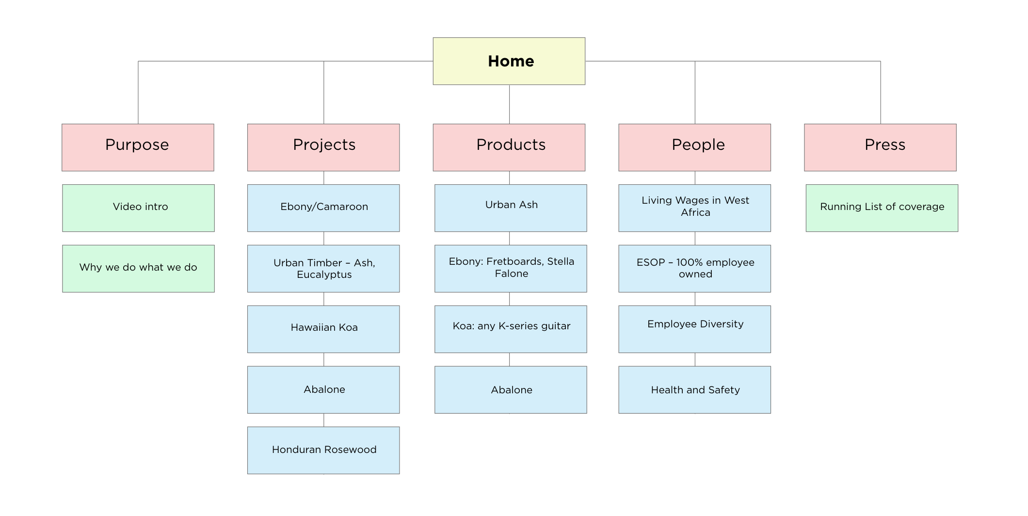
Coming up with a content map and considering the information architecture of a project is one of my favorite phases. Getting everyone in a room together, and laying out on the table what all the stakeholders in a project think…before any designing gets done. Often I like to talk to co-workers and collaborators individually to talk through any ideas they might have for the project. The process is similar to conducting user research, but with internal teams and collaborators as opposed to end users.
Key Insights for this projects
After discussing the project with stakeholders a couple of key aspects were highlighted to give us direction for the initial discovery work.
The primary goal of this new section is to surface sustainability project work in a way that's clear, engaging, and easy to navigate.
There was a need to establish trust early on in the experience. Saying we’re working on a project isn’t enough, we need to show that other qualified brands believe in these projects too.
This experience to be ‘brand adjacent’, living on its own and able to grow, but still being associated with the base company.
There needed to be simplicity to the navigation, and information needed to be scannable for users who didn't want to spend a ton of time reading long form content.
Competitor Analysis
I love being inspired by others. There are so many great ideas out in the world, and so many amazing brands that can help bring your own ideas to life. For this project I looked at brands known for telling stories based in social and environmental issues. Brands like Patagonia, The Nature Convservancy, and also direct competitors like Martin and Fender.
Side Bar: Part of the reason I love conducting competitive audits is to see what brands with a very high design maturity are developing. Not every team is ready to conduct rounds of researching, testing, and iterating. That might be from a lack of education on UX, for legal reasons, or technological debt. When conducting a competitive audit I think it’s important to keep this in mind. The company focused on developing new technology is able to consider solutions that wouldn’t be possible at a company still working on understanding how to empathetic to their users to help them complete their goals.
Side Bar: Part of the reason I love conducting competitive audits is to see what brands with a very high design maturity are developing. Not every team is ready to conduct rounds of researching, testing, and iterating. That might be from a lack of education on UX, for legal reasons, or technological debt. When conducting a competitive audit I think it’s important to keep this in mind. The company focused on developing new technology is able to consider solutions that wouldn’t be possible at a company still working on understanding how to empathetic to their users to help them complete their goals.
There is very little ‘green washing’ in the messaging. The brands that are telling the most successful stories, and conveying their messaging in the clearest way, are doing it in a very high level, non-force fed way.
The content is evergreen, and grows as the brand grows. There are new stories, and updates for most of the projects being shown. It’s not enough to ‘set it and forget it'.
Products take a back seat to story telling. Very, very rarely is there even an inkling that the user is being put into a purchase funnel. The focus is on the content, not on the products.

Surveys and Pain Points
It’s one thing talking in a room with a handful of coworkers, it’s another getting out there asking people what information they want, and what solutions would be helpful for them. I did some independant user research early on in this project to understand what the users wanted, to help inform the initial designs.
Users felt like every brand is trying to spout some kind of sustainability story these days. It’s important to them that the brands they buy from are doing ‘real work’, not just saying they’re doing the work.
Users are looking for two kinds of information. The first is quick information that is easy to digest, with easy to understand facts. The second is long form content, with information that legitimzes the efforts, and explains why the initiative is important.
The users also backed up the teams' feelings that establishing trust was important. They referenced other websites that show publications and news shows that talk about the projects.
We developed user personas and user stories for this new section of the site. Recent data showed that our user demographic has been trending younger. We also looked at data from across the web and noticed that younger (millennial, Gen X) demos were placing en emphasis on corporate responsibility in their purchase journey.
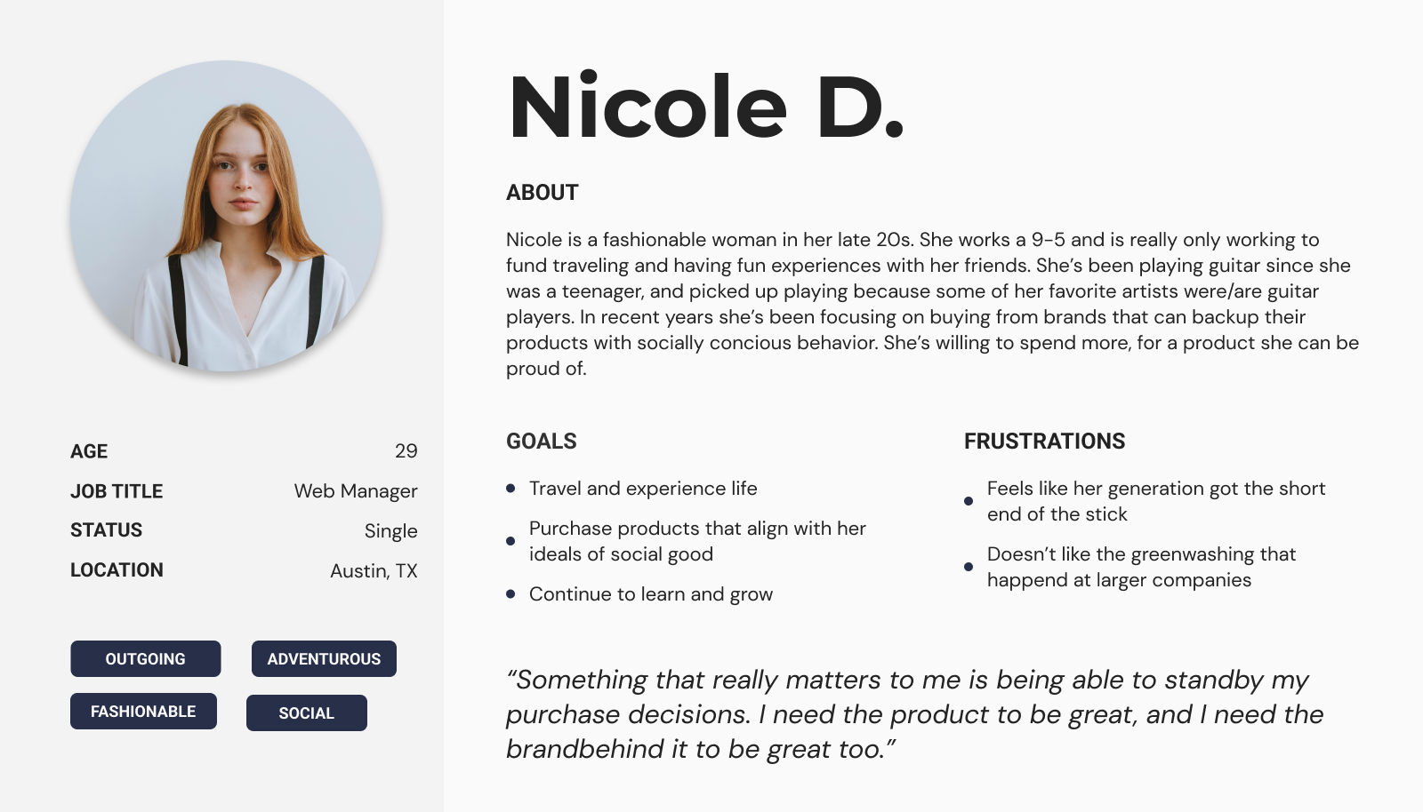
As an outgoing adventurous person, I want to make good purchase decisions so that I can feel good about the amount I’m spending.
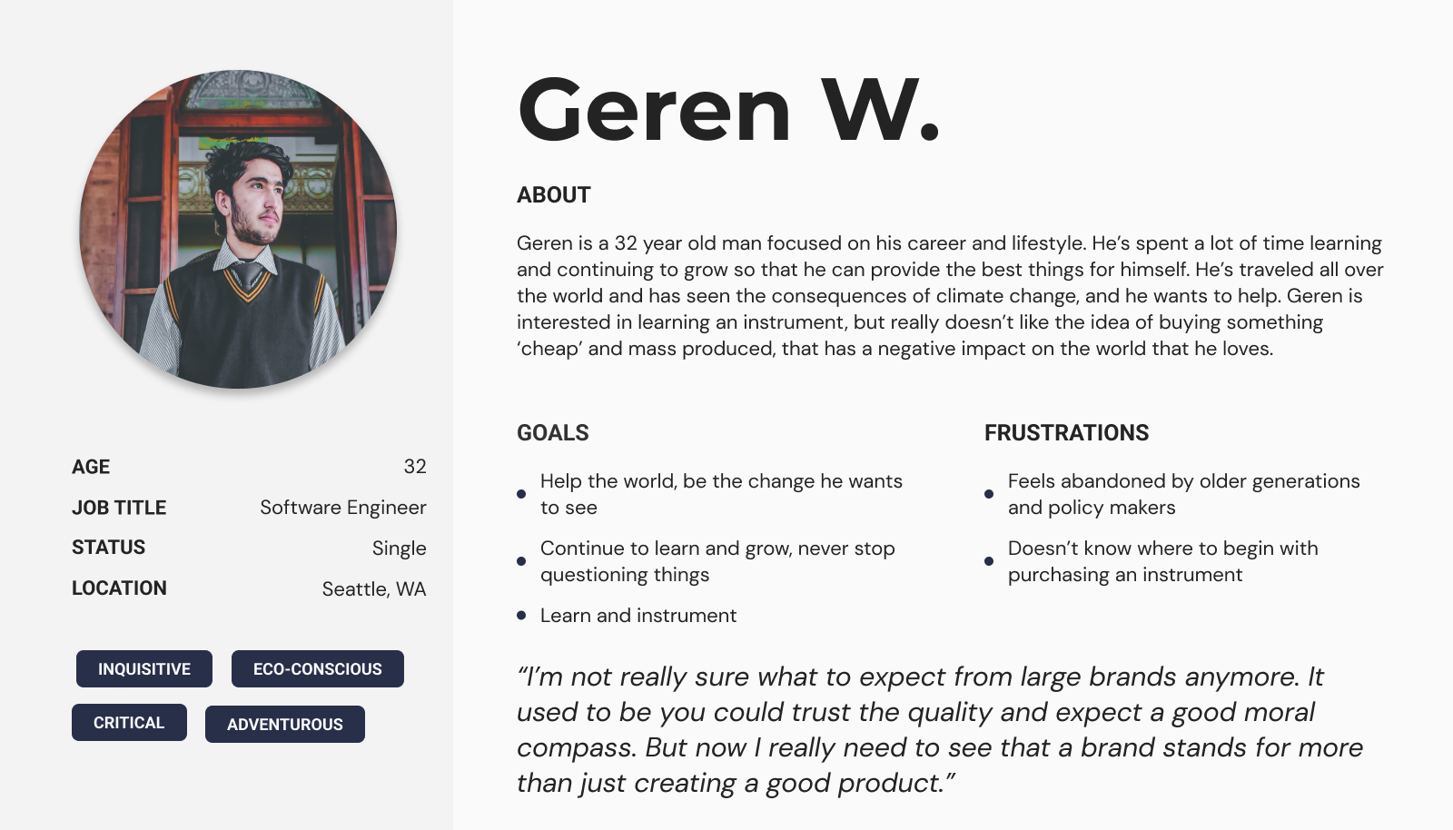
As an social justice warrior, I want to align my passions and my wallet so that I can find new hobbies and have new experiences that help make a difference in the world.
Architecture and Storyboarding
Content is king, or so they say. Using the insights from the intial round of testing/surveys we can start to think about the content that’s going to live in on these pages. In my experience this process takes longer than expected. It’s good to get the ball rolling with brainstorms, and even quick mockups because all of the assets needed to support the content will likely take months and need to be budgeted for.
There are a couple of larger stories and projects that must be present in the experience. These are non-negotiable for the stakeholders.
An overview section is a good place the talk about the ‘why’ of the projects and to show off some quick stats for the users who don’t want to spend time diving deeper.
Having overview content on the ‘home’ page will help users decide if they want to go deeper into the experience.
Make sure that SEO stays top of mind, it’s not just sustainability that we’re interested in ranking for, but also how that ties into guitar and sustainability leadership searches.
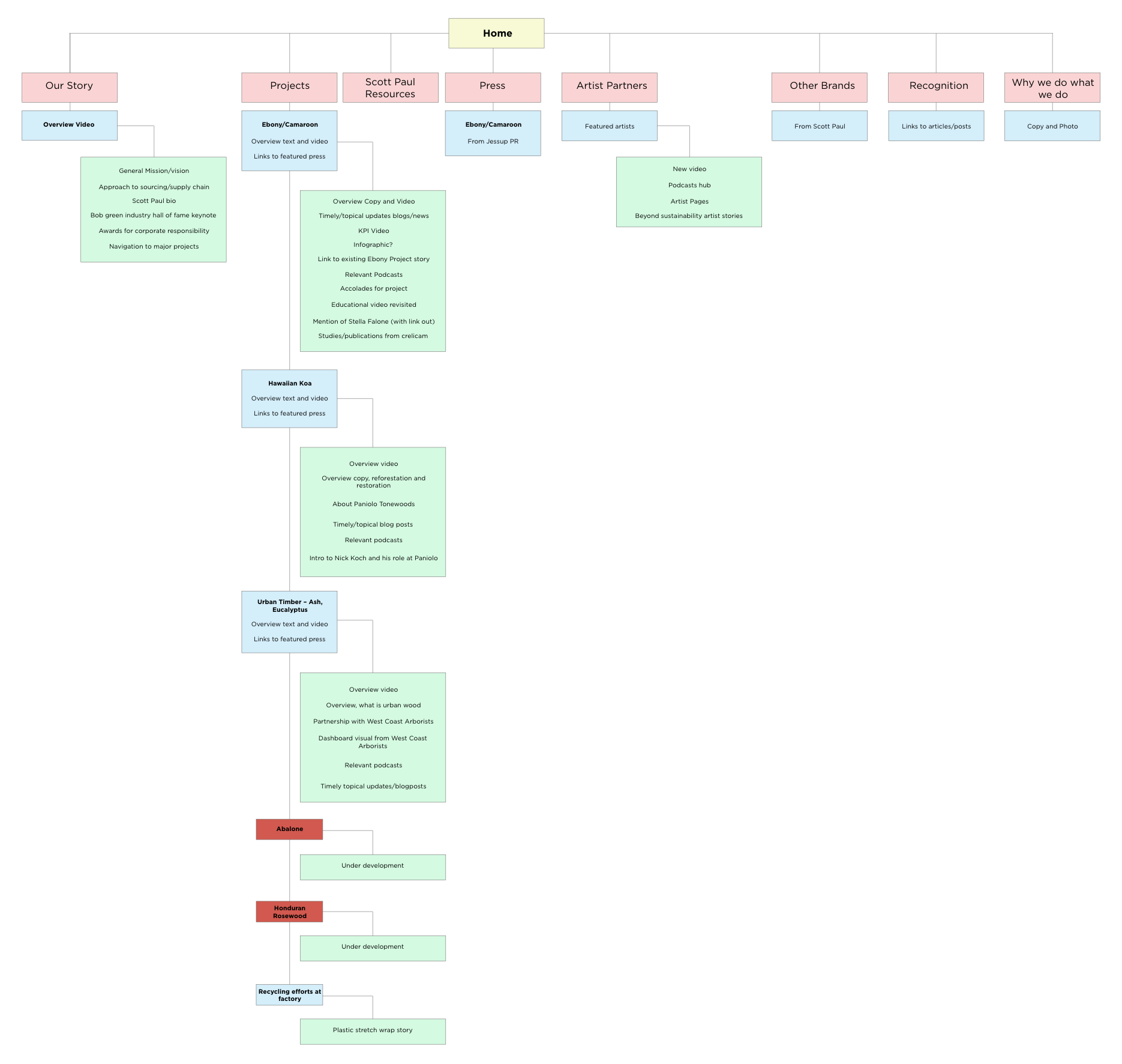
Starting LoFi
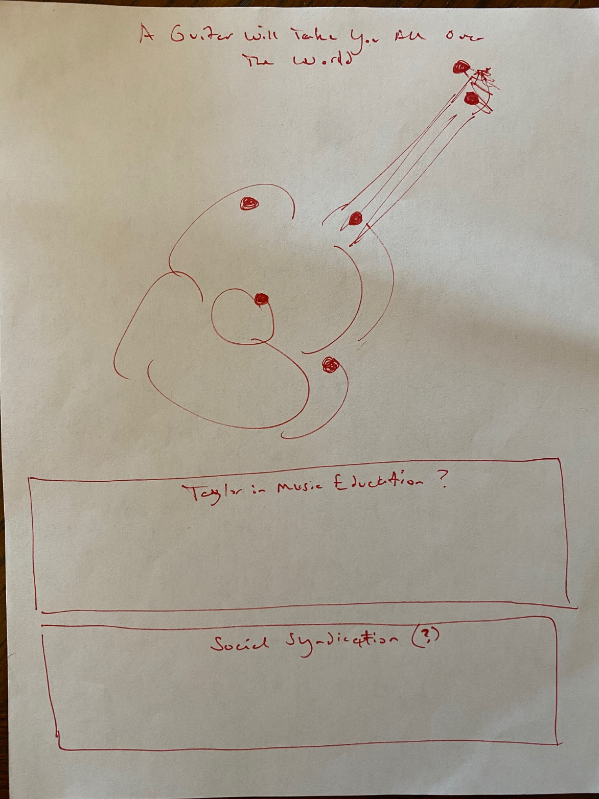
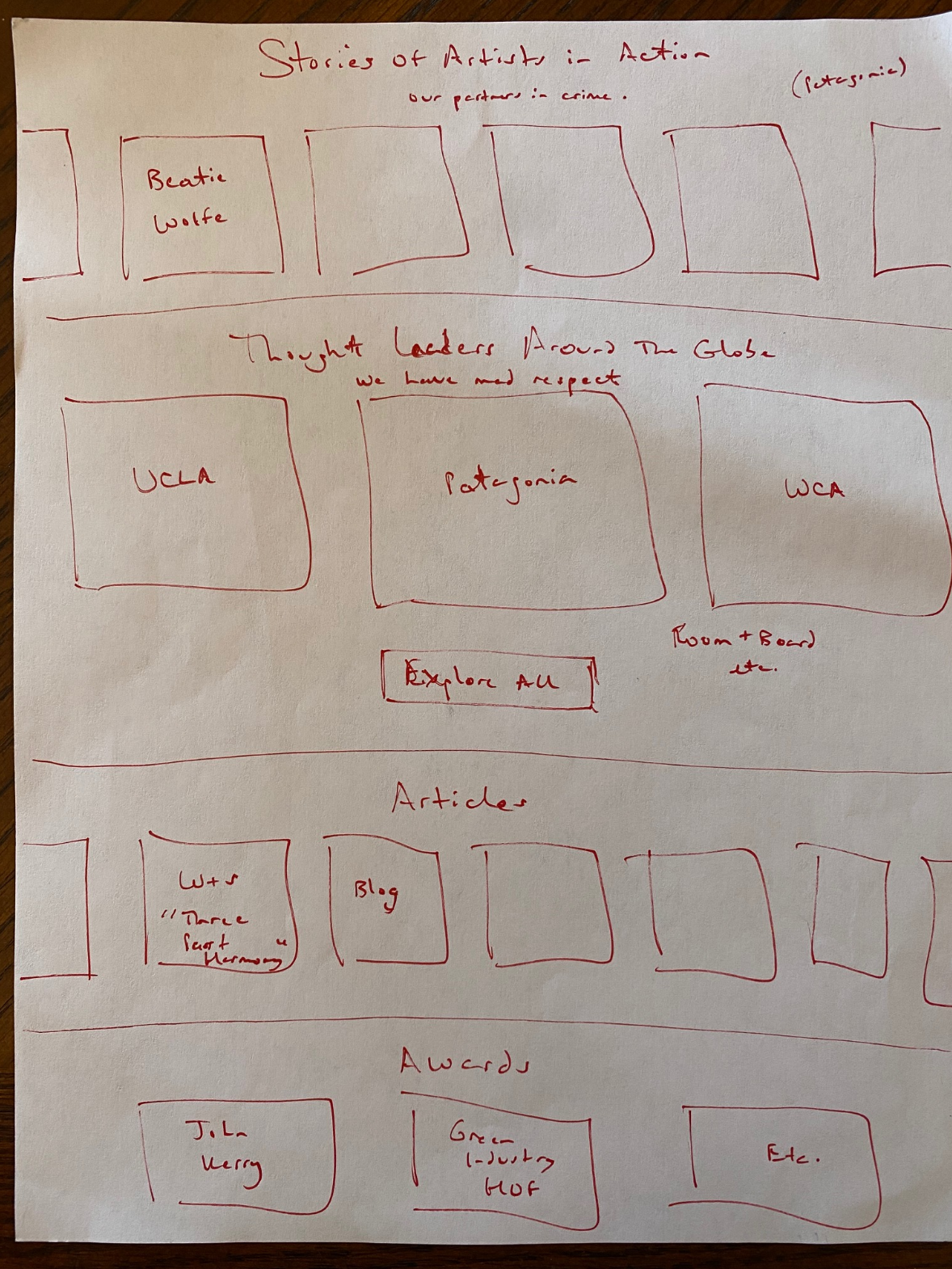
Good ole fashined pen and paper. LoFi prototypes are a great way to get lots of ideas down quickly. I started with a quick sketch of the landing page, just marking out the content sections.
I ran a crazy 8s exercise with the team, and followed that up with some potential landing page options to bring back to the team. Some ideas like social sharing, and more interactive modules like the guitar focused module were still included, even though they seemed like a reach.
I ran a crazy 8s exercise with the team, and followed that up with some potential landing page options to bring back to the team. Some ideas like social sharing, and more interactive modules like the guitar focused module were still included, even though they seemed like a reach.

Low Fidelity Wireframes
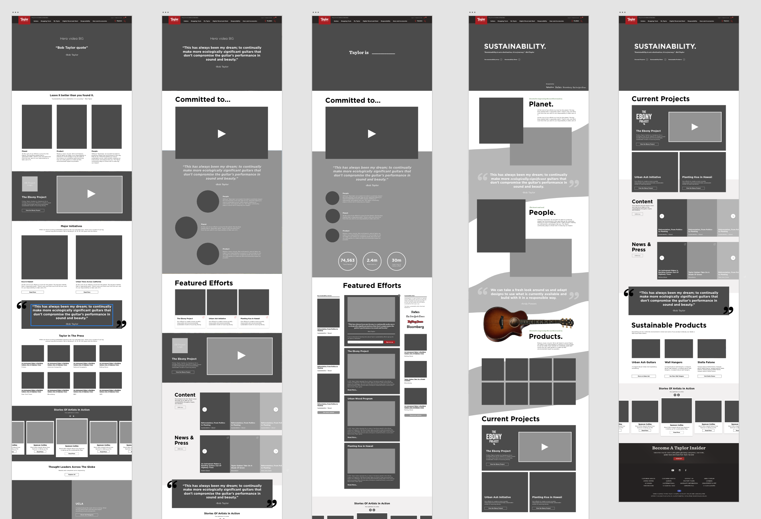
From the hand drawn prototypes to the computer. With the basic outline of the page signed off on, it was time to move onto the computer. I love iterating within the design programs, so wireframing is one of my favorite steps in the design process.
Stats feel small and insignificant on the homepage. Save individual statistics for the child pages and story pages.
The team really likes having large quote blocks – keep these in and explore different design options.
Video needs to be easily found, and easily played – don’t make users go further into the experience to watch videos.
Decide how to prioritize projects vs. new content vs. social.
Bring back the elevating of ‘trust’ sources. Where did the publications and ‘as seen in…’ go??
User Testing
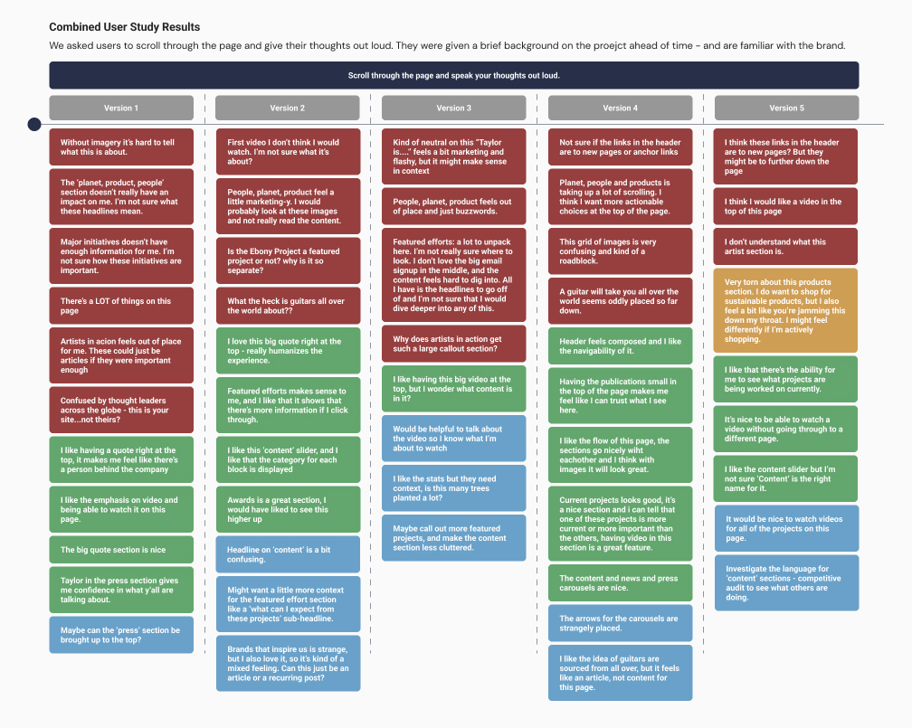
With 5 unique layouts for the homepage we setup a user test to make sure we were on the right path. This was a simple test where we asked users to scroll through the page and think out loud as they did it. Before participating users were given a brief summary of the project, and all users were familiar with the brand.
This test was a success and we gained a ton of insight from it. Those insights will be used in the next round of designs and will help inform a lot of the content decisions we make for the experience.
This test was a success and we gained a ton of insight from it. Those insights will be used in the next round of designs and will help inform a lot of the content decisions we make for the experience.
Module Prototyping
Next I started developing higher resolution modules to pitch to the team. This is when designs really start coming to life. Working with existing assets and making new designs is always exciting. Using insights taken from all of the steps of the process so far I worked on bringing some color and excitement to the experience.
It helps to have design and content teams working together, and this project is no exception to the rule. Working in tandem with the content leads I comped a variety of new modules to help tell the stories. Something that experience has taught me is that simple is usually better. Yes, we can make a super immersive VR jungle experience, but is it worth the resources, dev time, and upkeep, or is there a much simpler way to tell the story and help the user along on their journey?
It helps to have design and content teams working together, and this project is no exception to the rule. Working in tandem with the content leads I comped a variety of new modules to help tell the stories. Something that experience has taught me is that simple is usually better. Yes, we can make a super immersive VR jungle experience, but is it worth the resources, dev time, and upkeep, or is there a much simpler way to tell the story and help the user along on their journey?
Main project module
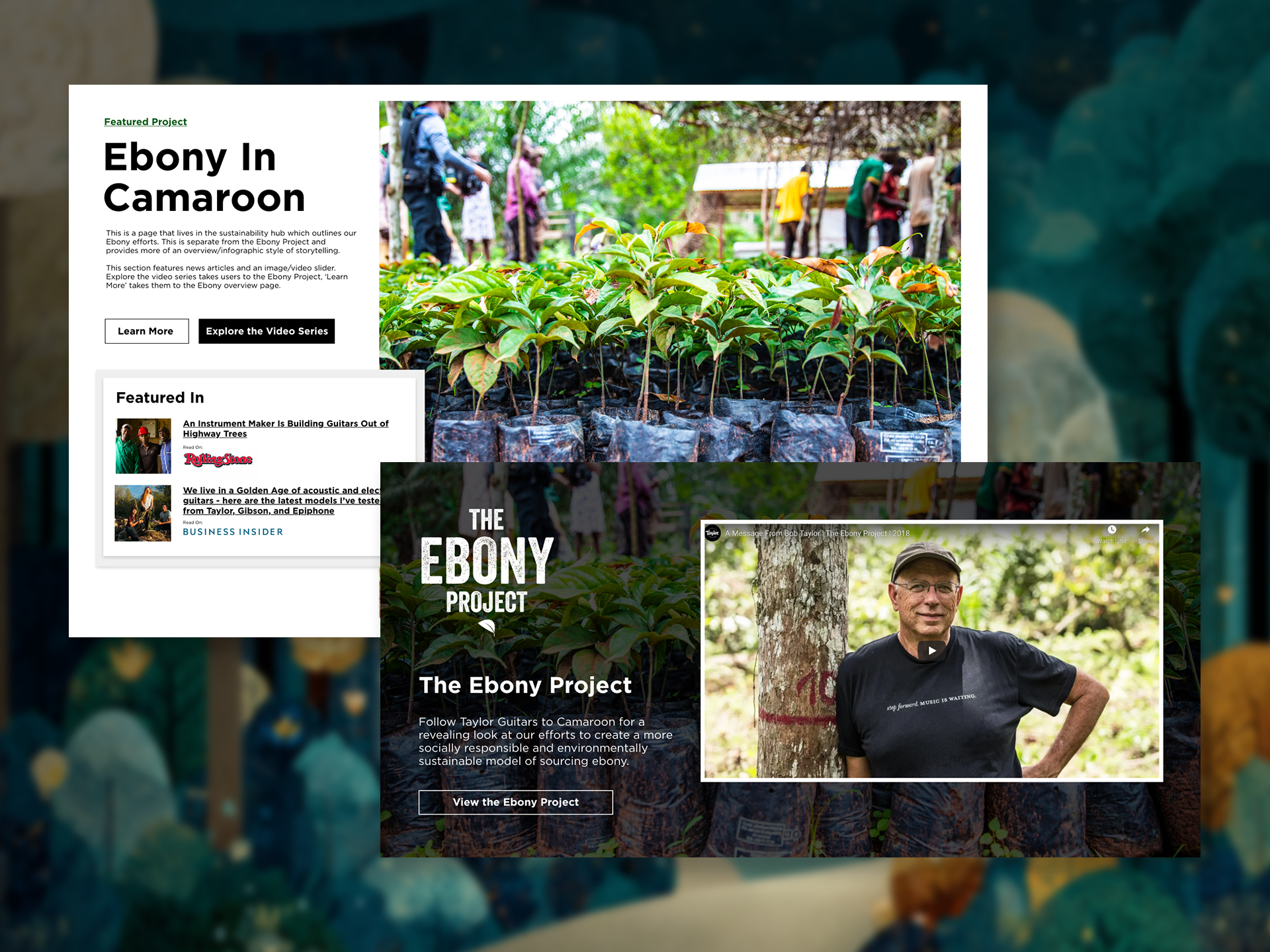
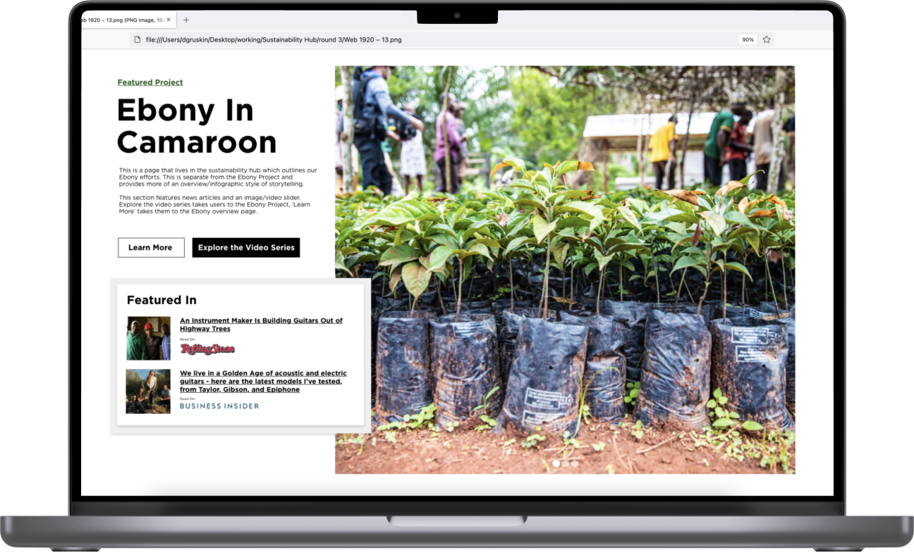
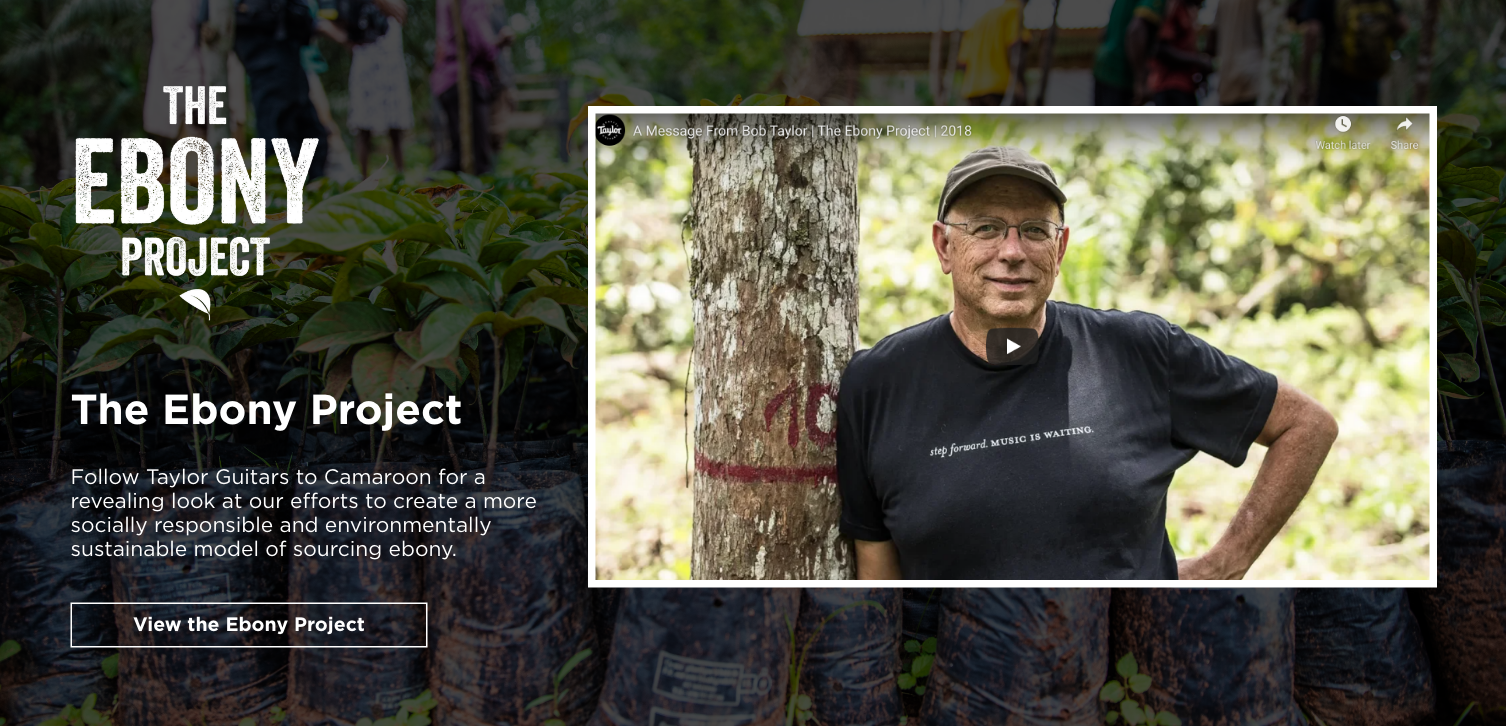
This is a module for a featured project. These projects will have overview videos, and individual page(s) that will give the users the option for more content. It was important to have an overview, and a video view option for this homepage module.
After review there were a couple of changes to this module. We wanted to add in some kind of ‘trust identifier’. The branding of the project wasn’t necessary. We wanted a specific CTA to watch the video. The edited module can be seen below as the ‘featured project module’.
After review there were a couple of changes to this module. We wanted to add in some kind of ‘trust identifier’. The branding of the project wasn’t necessary. We wanted a specific CTA to watch the video. The edited module can be seen below as the ‘featured project module’.
Quote Module
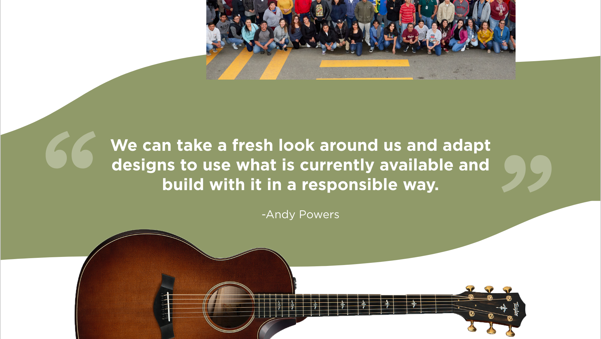
One of the characteristics of this experience that we wanted to maintain was having a human voice. Yes it’s a large company doing sustainability work, but it’s the people and the founders of the company pushing us to do it. Having quotes and elevating those quotes is a must.
Article Slider
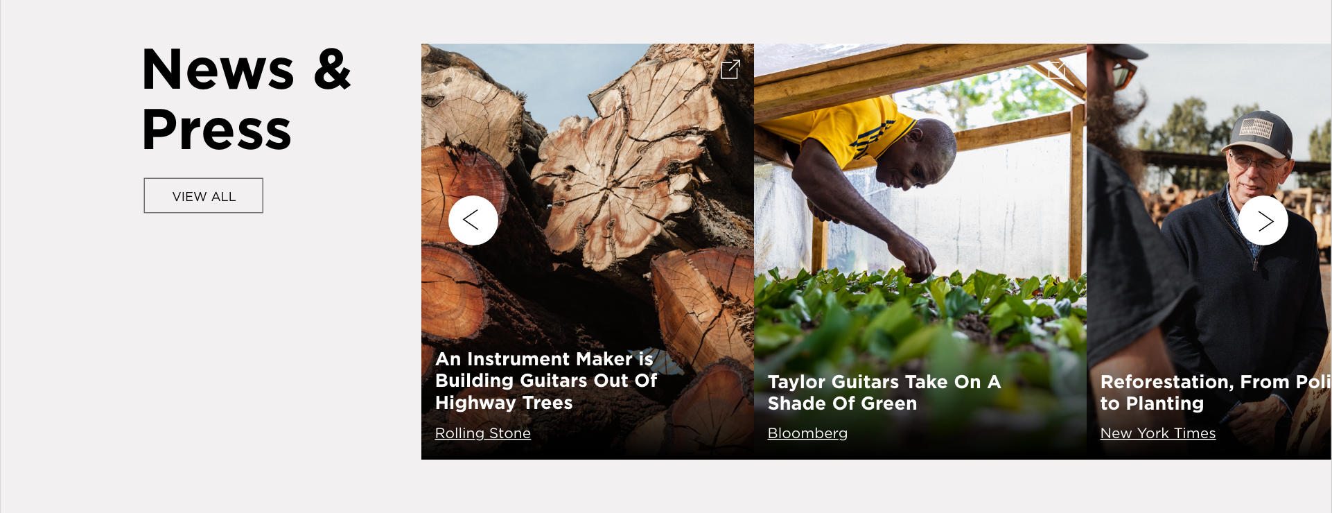
The article slider is a necessary utility for these pages. It can hold deeper related content, outlink content, and works nicely on desktop and mobile.
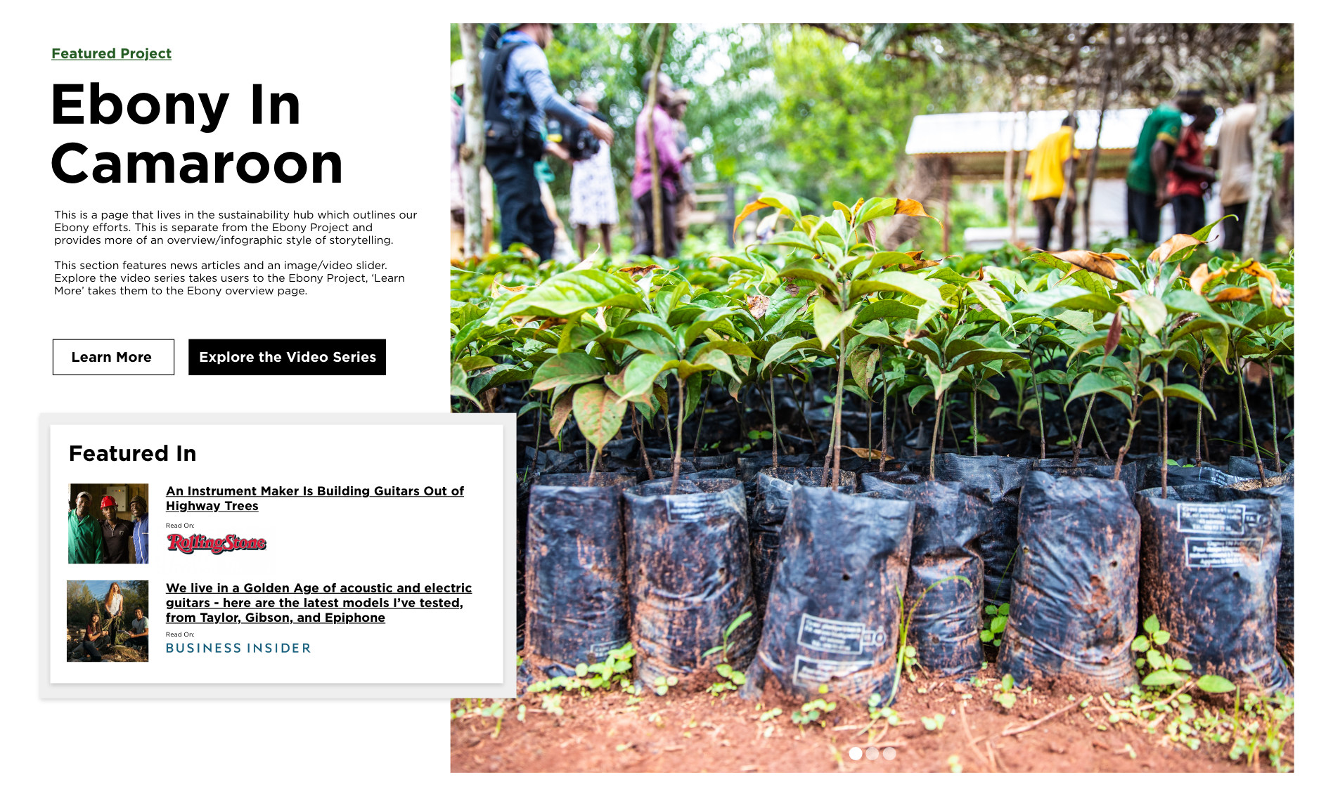
Featured Project
Featured project cards are the backbone of the experience. They need to be visual, compelling, feature video, and display the ‘trust’ factor (a.k.a. the news articles).
Art Direction
With the bulk of ideation behind us, it’s time to begin organizing assets. Plan new photo shoots, and video shoots to support the known content. Anticipate new asset needs and plan ahead for those. Develop a look and feel to remain consistent across the experience.
There are sooooooo many assets for some of the featured projects. Organizing them is a multi-phase process. I’ll make an initial pass, then work together with the content team to narrow down to a final selection.
Because of the emphasis on imagery in this experience there will be the need for new assets. Establishing the look and feel for ‘the hub’ is going to help with that.
Use video whenever possible. The videos should be shorter in length, and provide valuable insights. We can draw some insipiration for the look and feel from existing video assets.
For some projects we just need to work with what we have. It might not be possible to get new assets, so being flexible and creative is important.

HiFi Prototyping
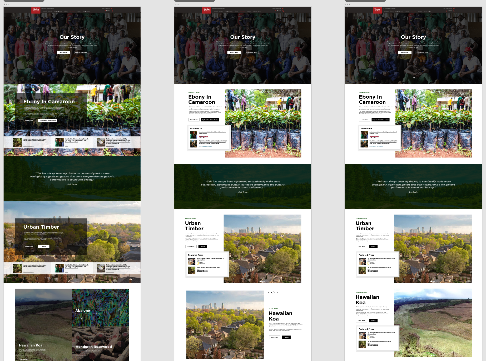
Create a ‘final’ high fidelity prototype to get final sign offs. This proto still contains some lorem and very little deeper content, but it accurately represents all of the major components and establishes the layout for the development stage.
Iterate, Iterate, Iterate
The main UX/design problem here was the sheer amount of information that had to go on these pages. There are a lot of elements and fitting them all onto a page without fatigue from information overload definitely wasn’t easy. We tried to break up large copy blocks, and provide clear imagery that helps to tell the story of the world’s finest guitars.


Final Steps
This project was in active development. Over the course of several months, I collaborated closely with developers to bring the designs to life. My background in web design and development proved especially valuable—being able to “speak dev” helped bridge the gap between design and implementation.
We began with the homepage and a primary project page. Since the experience was being built in WordPress, design changes were quick and cost-effective. This allowed us to test early iterations of the developed experience with users to ensure the flow was intuitive and the content made sense. Once we validated the initial flow, we moved on to building out the remaining project pages.
The entire experience was structured around modular design. To support this, we developed a component library to ensure consistency and scalability. Reusable elements were designed once and implemented across multiple pages to maintain cohesion throughout the site.
After testing and core development were complete, I—along with other team members—built out the remaining pages. This involved close collaboration with cross-functional teams to finalize content and ensure the information stakeholders wanted to highlight was presented in a way that aligned with user needs and expectations.
No project is perfect, making concesions and choosing your battles is a part of every larger project.
Make sure the user stays top of mind for at every step. There was a round of design where the team got caught up in features, and lost sight of what was important for users. We quickly corrected, but if we had gone forward with those designs the end product would have been flawed.
Start thinking about assets early and often. With content heavy pages and experiences content like imagery and video can really slow down the launch timeline. Factor in these components to the overall timeline, and make sure there’s time for reviews and editing.
The closer you work with developers and content teams, the more user friendly the final product will be. The UX designer is the person thinking ‘user first’ – not the other team members. I am the advocate for the user, and the more present design is at various stages, the better the experience will be in the end.
